Saturday, January 30, 2010
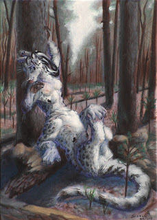
Portrait of Bluefire
A portrait of chakasa Bluefire done as a present for my good friend leonardo. Bluefire works as an Environmental Restorer, a rather difficult job which is basically fixing/cleaning up the mess left by the late industrial age, back when earthlings deluded themselves that the planet's resources could be exploited without limits.
Most of hir job revolves around slowly restroing soil fertility and biodiversity into barren areas, so that in a few centuries they can produce something again. Here however shi is just taking a pause into a recently burned down wood, where new saplings are beginning to grow back.
Acrylics on board. Unluckily no WIPs for this as I was very unsure while painting it and thought I'd have to restart any time, so I didn't make photos of the various stages... I really need to get past this stupid worrying. Also because now I'm able to correct most mistakes along the way.
For the palette I used many colors but the main components for the background are violet and phtalo green, the rest is various shades of gray done with combinations of blacks (Mars and ivory, the latter has the lowest value), titanium white, ultramarine, Van Dyck brown and yellow ochre.
Wednesday, January 27, 2010
More 30 minute sketches
The next posts will be more about anthros, WIPs and annotated sketches, but in the meanwhile I think sharing these exercises is useful too. They are not very funny to do, so it's better to do them inbetween other stuff rather than diving head first into them, but they teach a lot of things which I wouldn't feel comfortable trying in a proper picture. All of these are acrylics on paper with classical limited palettes of 3-4 colors (for most of them Yellow ochre, burnt sienna/Van Dyck brown, titanium white, ivory black).
For the animals I started from photos which look very static and I tried to add some feeling of movement using the direction of strokes:
For landscapes I'm doing mostly value studies, trying ways to render things like tangled branches and mist:
(This is an ice cliff painted with an odd palette of white, black, ultramarine, and cadmium red for the shadows.)
Also some loose drawings, mostly exercises to keep the species recognizable in spite of stylization or parts of the body being hidden:
Wednesday, January 20, 2010
"Harvest Moon" WIP 3
Currently the way I do the first stages of paintings has been influenced a lot by the excellent Foundation Painting DVD by Shawn Barber. Basically he describes starting with a rough pencil sketch on the canvas and thinking of painting as refining the drawing, just like one would do with pencil. I like sketching and drawing much more than painting loosely, so this approach immediately felt natural to me.
The first step was the phtalo blue underpainting, pencil sketch and some light washes of white to figure out the brighter areas. Then I started with the sky since its color and lightness are very dominating and thus it's better to have it in place before starting with the owls, which will have a lot of white and would easily come out too bright without the background as a reference. (Owls on the trees need to be less bright than the main girl, because they are further away and making them full white would distract the eye from the main girl too soon, which would make the scene look too crowded and confusing.)
With the sky in place it is safe to start with the owls. I started from shadows because in general it's easier to paint with bright colors over dark colors (it's much easier to keep the color under control and get subtle shades of gray). But this time I will really leave the lightest and darkest colors last. Having them in the painting since the beginning is very distracting - I end up with a distorted perception of the intermediate colors and I end up painting more abrupt changes of value instead of subtle variations, like it happened in the crucified owl painting...
Wednesday, January 13, 2010
30 minutes studies
In 2009 I've been doing exercises jumping round-robin from one kind of exercise to the other, but now I think I need to focus on certain exercises for a few weeks in a row in order to learn the difficult stuff. Now for daily exercises I'll focus for 1-2 months on quick paintings, with two main goals:
- Learning more about lightness and about color temperature of low saturation colors (i.e. how to use effectively warm and cool grays in the same picture, to suggest light of a certain hue etc.);
- Applying to actual pictures the things I learned about landscapes with the ink exercises.
I'll work mostly with limited palettes and low saturation colors so I can concentrate just on lightness and temperature. A good palette for this kind of studies (as suggested on ConcpetArt.org) is:
- yellow ochre
- titanium white
- burnt sienna
- a very dark black
Most blacks mixed with titanium white result in cool grays, so this palette allows to experiment with both warm and cool grays. It is optimized for human skin tones but ochre and sienna are very flexible colors and it's fine for studying values. In some cases (like the camel picture below) I replace burnt sienna with Van Dyck brown to keep the saturation lower.
I'll try different styles but I also want to focus on wide brush strokes, on the track of Sargent and digital speed painting, because they look awesome and they seem a good way to render complex movements as those of birds in flight.
Sunday, January 10, 2010
Studies from 2009 - Landscapes, with more detail
These were done a few months after the first attempts at this exercise. After getting used to think of values first, details no longer feel so distracting! I'm trying to ignore most visual noise and go for the most visible shapes. At this point it should be safe to put in some details: once you learn to get the big picture you also learn which details are useful and which ones are not, so there can be a few more branches as long as they they don't harm clarity. (Again india ink, from random Flickr photos.)
Thursday, January 7, 2010
"Harvest Moon" WIP 2
For the crucified owl I did just some very basic tests to decide the colors, but since I'm not quite comfortable with colors yet, for this painting I did again many tests as for the oryx painting. For now I want to experiment with direct complementaries and I like using fairly crazy hues... so I came up with a cadmium red - phtalo blue palette similar to this one (painting by Zdizslaw Beksinski):
I'm also a bit obsessed with learning complementary underpainting, which is hard to do properly but allows for very nice effects. After a few tests it turns out that a phtalo blue underpainting with red/brown on top of it may actually work and create some interesting contrasts and blur effects where it is not completely covered:
The sky is probably going to have some more blue, to give more volume to the clouds. On the left a test for feathers (the yellow is ochre). Probably they won't look exactly like that but the contour effect is very interesting and is what I'll try to get in some places. The light/shadow colors albeit unnatural look oddly consistent. For them I followed the simple rule of thumb of giving shadows the opposite hue and temperature of the light: since the moon is going to be very bright blue, the shadow areas should be in the red/brown range. I've used for them a warm grey obtained just from the two main colors, phtalo blue and cadmium red.
Because they are near perfect complementaries on the color wheel they can mix to a very dark grey, and adding more of either color shifts the grey to either cool or warm in a nice gradual way. With such good grays available I'll probably need very little black for the painting.
I also tested carefully how the values should be distributed in the image, to make sure only the main figure gets the brightest highlights and everything is well contrasted:
And here we go!
Sunday, January 3, 2010
Studies from 2009 - Landscapes and interiors
Speed painting (mostly from random photos off flickr) done with India ink and a large brush:
The goal in these is forcing myself to ignore details and look just at the apparent values of the landscape - light and dark areas. The principle is the same of the gesture drawings of animals.
If I sketch landscapes with a pen I tend to draw a huge flat mess like this:
I sketched this in a hort full of plants and visual noise (many small leaves and branches etc.). In such situations I get distracted by details and I don't even think about values, but values are the most important thing to achieve a good composition, so they are also the most important when drawing a landscape from the mind. This was the first painting where I designed the landscape thinking just of values and light/dark areas:
Subscribe to:
Posts (Atom)