Friday, February 25, 2011

Seagulls WIP, brush strokes


I did a silly mistake at the beginning by drawing the whole grid on the canvas. Usually I only draw the dots at the grid's intersections as they are enough to copy the drawings with accuracy and they disappear under the paint. The grid lines instead show through most colors and that's really annoying, but hopefully they won't be too obvious in the end.
I've actually seen paintings around where the lines are still visible, and usually you don't notice them unless paying close attention since they tend to get lost in the overall impression. I leave some of them visible on purpose in my pencil drawings but I don't like this too much in paintings.

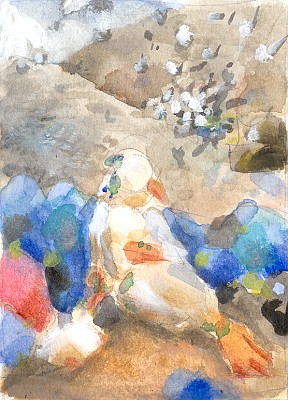
So far I've used only the restricted earths palette, which now is up to six colors as I've found the Sepia I was looking for. The final colors will be different in some places (some bags should be almost cyan) but I'll shift the hues and adjust saturation later. For now I just try to match as closely as possible the color I want in each area using only the six available tubes.

Painting a convincing mountain of trash is not going to be easy... it seems there are a few common conventions that illustrators stick to when drawing or painting such places, I'll write a bit about them in the next post.


This is the first time I pay real attention to the brushwork too. Before I was too busy trying not to make a mess and lose control of stuff. Among others I'm studying the brushwork of Degas, Frazetta and Leyendecker, and the bags here owe something to the latter. I don't like the way he painted figures but for some objects and plants it makes very cool textures. Degas's handling of colors is probably impossible to imitate in acrylics though...

Tuesday, February 15, 2011

Tough seabirds


Stared the painting after a ton of studies on seagulls. I wanted a slighly tough-looking girl since gulls are such badasses:


For the flocks of birds storming to the background I used a very abstract approach. First I tried to imagine two or three groups of birds and the overall shape of each group. I want their motion to kinda point to the main figure, so I thought of a few triangles. The lines going across each triangle are to suggest that they have different orientations in the 3D space:


Then I just drew the birds keeping into account these triangles and their inner lines, so that the lines of action of the birds follow them. This should give the flock a believable 3D look and keep the picture readable. I did this after several days of drawing seagulls to get a hold of their shape from various angles...


Some of these are loosely based on photos but most were drawn from imagination after a bit of warming up.

Sunday, February 6, 2011

The Sexy

I'd like to share some notes on erotic pictures too. Here are the best samples from the last few months.

Birds are soooo sexy.

 The best things in life - thick fur and pussy.

Some furry/anthro erotica is worth the effort just for the sheer humourous value, something which is oddly underplayed by artists. But nature is quite full of funny situations...

Thursday, January 13, 2011

Seabirds and trash

 ...are going into the next painting. It's a seagull girl sitting into a dump hugging a friendly RL seagull. I'll decorate her with some terrible pseudo-raver teen fashion jewelry. The idea just popped up like that... amazing how "trash" and "dump" are among the first things which come to mind when thinking of seagulls, along with the beauty of the sea (on instead of it).
The drawing itself not yet ready but I have a good idea of how it should look like more or less. The colored stuff is a heap of trash bags which ironically sport beautiful colors at times. The confused dots at the top are a flock of seagulls storming the dump. The dark thing on the right is an excavator.


I haven't abandoned all the avatar and the feedlot ideas I wrote about, but I sorely needed more color practice before tackling them since they are going to be a lot more difficult than the latest paintings. This one hopefully won't take too long.

Sunday, January 9, 2011

Current palette


I've matched as closely as possible the main acrylics palette and main watercolors palette I'm using so it should be easier to use watercolors as quick tests for paintings. The match is not perfect for the Brown Ochre and Venetian Red but close enough. I'll probably add an equivalent of Sepia to the acrylics palette too since it's fantastic for mixing low saturation colors and warm grays.


Master studies in watercolor with the palette above (plus a small amount of a primary cyan) and the original paintings. The studies are very tiny at 2-3 inches across. I'm not trying too hard to match the exact colors or shapes for now, I'm more interested in the way values are distributed across the picture and how I can use the limited palette to approximate a color scheme. But especially the value map, since the one for the feline avatar was screwed up.

Monday, January 3, 2011

Durer's other hare


The one who rented him the workshop rooms and sold him paints. Sometimes she also agreed to pose for him, as he seemed to have a peculiar fixation with leporids.

Having some fun to warm up after a chaotic month.

Besides the mannerism inspired to work of Durer's period the pose is a bit unnatural, but I had this specific pose and composition with the Celestial Globe so clear in mind that the all tests I did of alternative poses felt wrong - either the hare was too tall or didn't show the right curves. This happens a lot to me and I always wonder whether it's intuition at work or lack of observation. I admire a lot artists like Ingres who managed to harness this tendency to disregard anatomy and physics in favor of composition and yet produced very refined works.