I wrote a previous note about gesture drawing for animals, but that example was about birds which are easy to sketch quickly, though it's very hard to draw them accurately or in unusual poses and the wings are a puzzle on their own. With quadrupeds even getting a basic shape right is more difficult.
At the beginning my biggest problem with quadrupeds was that I saw too many things going on - too many limbs in motion, too many lines to follow, too many masses:
When doing gesture drawing of humans the most important line is usually the backbone, and all other lines follow logically from it. Sometimes it is obvious in quadrupeds too:
But I look on purpose for weird poses where it is hard to figure out which lines are the most important for the overall shapes. Giraffes have unusually long legs, the neck is a unique feature which changes a lot the visual balance of their body, and on top of that their movements are very constrained. So trying to make giraffes look agile and not stiff is an interesting exercise.
The little figures on the right are a possible way to sketch quadruped poses considering only a few main lines and masses. I did a lot of them too and it turns out they are also a good exercise in synthesis, to train oneself to remember well the proportions and two or three key features of a species. The can be useful to study features at any level, for example to study small differences between species which look very similar, as in this example with antelope horns:
Tuesday, March 30, 2010
Thursday, March 25, 2010
"Harvest Moon" WIP 6
It's not missing much! I need to finalize the sky, paint wheat at the bottom and then do small retouches.The big owl was not supposed to look exactly like a real barn owl but I'll probably add tiny brown dots and a viel of ochre in some areas, as she looks too plain.
I wonder if the inner feathers of the wing on the left are too dark, they probably need to blend better with the arm and the outer feathers.
I wonder if the inner feathers of the wing on the left are too dark, they probably need to blend better with the arm and the outer feathers.
Thursday, March 11, 2010
"Harvest Moon" WIP 5
I'll keep the number of color tubes used low for a few more pictures - with this one I'm learning a lot on how to control saturation and hues but I'm still not very comfortable with mixing desaturated colors from more than two colors (plus white). Most of the gray areas area a mix of phtalo blue 15:3 and cadmium red with a small addition of yellow ochre. Working with two main colors to get the grays and a third one for fine tuning seems to work well.
I'm keeping the owls on the trees slightly out of focus to suggest distance too.
On a side note, how cool is this incoming movie?? It's about time for owls to get more love from the media. :-) Don't forget to give a caress to your garden's owl today.
http://www.youtube.com/watch?v=hsAErYNyRuE
I'm keeping the owls on the trees slightly out of focus to suggest distance too.
On a side note, how cool is this incoming movie?? It's about time for owls to get more love from the media. :-) Don't forget to give a caress to your garden's owl today.
http://www.youtube.com/watch?v=hsAErYNyRuE
Friday, March 5, 2010
"Shadows" finished
I'm aware that dazzle painting is probably not very useful for hunting rabbits, but I still find it cooler than symmetrical tribal paintings and such! It might actually provide some camouflage in a thick undergrowth. In future maybe I'll paint that on a cetacean.
Some kinds of dazzle painting actually made use of strong colors, even red like the vixen's fur:
Wednesday, March 3, 2010
"Shadows" WIP 2
Gave priority to this smaller picture while I meditate about the hues needed by the owls and the horse goddess.
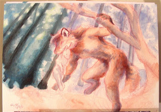
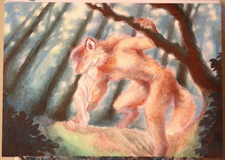
I started with a thin underpainting of ultramarine and burnt sienna, but the hues didn't look quite right on the background, so I started covering it with a rather thick layer of paint and I think it will hide it completely. In the end the palette is just phtalo blue 15:3, burnt sienna, titanium white and little bits of cadmium yellow light. The range of hues and values which can be done with just phtalo + sienna is amazing, it looks like many more colors are being used rather than just two.

I need to give more sense of volume and depth in my pictures, so I experimented with a few technique which improve the illusion of depth. In this case I'm painting the background forest slightly blurred while the fox will be mostly well focused. It's a very basic technique for adding depth, and needs to be done with care because it's very very easy to overdo it and make the background look messy and fake. In this case though I think it should work fine along with the scattered light through the leaves coming from the background plane itself. The blur should add to the light effect to create the impression of a slightly hazy atmosphere.

I started with a thin underpainting of ultramarine and burnt sienna, but the hues didn't look quite right on the background, so I started covering it with a rather thick layer of paint and I think it will hide it completely. In the end the palette is just phtalo blue 15:3, burnt sienna, titanium white and little bits of cadmium yellow light. The range of hues and values which can be done with just phtalo + sienna is amazing, it looks like many more colors are being used rather than just two.

I need to give more sense of volume and depth in my pictures, so I experimented with a few technique which improve the illusion of depth. In this case I'm painting the background forest slightly blurred while the fox will be mostly well focused. It's a very basic technique for adding depth, and needs to be done with care because it's very very easy to overdo it and make the background look messy and fake. In this case though I think it should work fine along with the scattered light through the leaves coming from the background plane itself. The blur should add to the light effect to create the impression of a slightly hazy atmosphere.

Subscribe to:
Comments (Atom)


